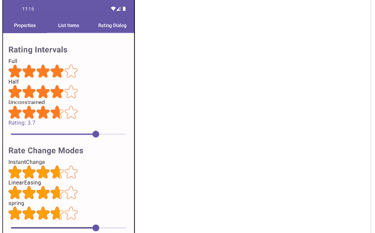
Rating bar to set fixed value or change rating by gestures with custom png files, ImageVectors with
customization and shimmer effects.
Gradle Setup
To get a Git project into your build:
- Step 1. Add the JitPack repository to your build file Add it in your root build.gradle at the end
of repositories:
allprojects {
  repositories {
      ...
      maven { url 'https://jitpack.io' }
  }
}- Step 2. Add the dependency
dependencies {
    implementation 'com.github.SmartToolFactory:Compose-RatingBar:Tag'
}
Declrations
@Composable
fun RatingBar(
  modifier: Modifier = Modifier,
  rating: Float,
  imageEmpty: ImageBitmap,
  imageFilled: ImageBitmap,
  tintEmpty: Color? = null,
  tintFilled: Color? = null,
  itemSize: Dp = Dp.Unspecified,
  rateChangeStrategy: RateChangeStrategy = RateChangeStrategy.AnimatedChange(),
  gestureStrategy: GestureStrategy = GestureStrategy.DragAndPress,
  shimmerEffect: ShimmerEffect? = null,
  itemCount: Int = 5,
  space: Dp = 0.dp,
  ratingInterval: RatingInterval = RatingInterval.Unconstrained,
  allowZeroRating: Boolean = true,
  onRatingChangeFinished: ((Float) -> Unit)? = null,
  onRatingChange: (Float) -> Unit
)
@Composable
fun RatingBar(
modifier: Modifier = Modifier,
rating: Float,
painterEmpty: Painter,
painterFilled: Painter,
tintEmpty: Color? = null,
tintFilled: Color? = null,
itemSize: Dp = Dp.Unspecified,
rateChangeStrategy: RateChangeStrategy = RateChangeStrategy.AnimatedChange(),
gestureStrategy: GestureStrategy = GestureStrategy.DragAndPress,
shimmerEffect: ShimmerEffect? = null,
itemCount: Int = 5,
space: Dp = 0.dp,
ratingInterval: RatingInterval = RatingInterval.Unconstrained,
allowZeroRating: Boolean = true,
onRatingChangeFinished: ((Float) -> Unit)? = null,
onRatingChange: (Float) -> Unit
)@Composable
fun RatingBar(
modifier: Modifier = Modifier,
rating: Float,
imageVectorEmpty: ImageVector,
imageVectorFilled: ImageVector,
tintEmpty: Color? = null,
tintFilled: Color? = null,
itemSize: Dp = Dp.Unspecified,
rateChangeStrategy: RateChangeStrategy = RateChangeStrategy.AnimatedChange(),
gestureStrategy: GestureStrategy = GestureStrategy.DragAndPress,
shimmerEffect: ShimmerEffect? = null,
itemCount: Int = 5,
space: Dp = 0.dp,
ratingInterval: RatingInterval = RatingInterval.Unconstrained,
allowZeroRating: Boolean = true,
onRatingChangeFinished: ((Float) -> Unit)? = null,
onRatingChange: (Float) -> Unit
)Shimmer Effect
There are two types of shimmer effect
FillShimmer
@Immutable
data class FillShimmer(
    val colors: List<Color> = DefaultFillGradientColors,
    val animationSpec: InfiniteRepeatableSpec<Float> = infiniteRepeatable(
        tween(
            durationMillis = 3000,
            easing = FastOutSlowInEasing
        ),
        RepeatMode.Reverse
    ),
    val solidBorder: Boolean = false
)
is for solid foreground effect. solidBorder draws empty image over shimmer withtintEmpty.
Second shimmer type is for drawing gradient border with
@Immutable
data class BorderShimmer(
    val colors: List<Color>,
    val animationSpec: InfiniteRepeatableSpec<Float> = infiniteRepeatable(
        tween(
            durationMillis = 3000,
            easing = FastOutSlowInEasing
        ),
        RepeatMode.Restart
    )
)
Usage
“`kotlin
@Composable
private fun RatingbarDemo() {
Column(modifier = Modifier.fillMaxSize()) {
var rating by remember { mutableStateOf(3.7f) }
var rating2 by remember { mutableStateOf(3.7f) }
var rating3 by remember { mutableStateOf(2.3f) }
var rating4 by remember { mutableStateOf(4.5f) }
var rating5 by remember { mutableStateOf(1.7f) }
var rating6 by remember { mutableStateOf(5f) }
val imageBackground = ImageBitmap.imageResource(id = R.drawable.star_background)
val imageForeground = ImageBitmap.imageResource(id = R.drawable.star_foreground)

Column(modifier = Modifier.fillMaxSize()) {
  RatingBar(
    rating = rating,
    space = 2.dp,
    imageEmpty = imageBackground,
    imageFilled = imageForeground,
    animationEnabled = false,
    gestureEnabled = true,
    itemSize = 60.dp
  ) {
    rating = it
  }

  Text(
    "Rating: $rating",
    fontSize = 16.sp,
    color = MaterialTheme.colorScheme.primary
  )

  val purple500 = Color(0xff9C27B0)

  RatingBar(
    rating = rating2,
    painterEmpty = painterResource(id = R.drawable.star_background),
    painterFilled = painterResource(id = R.drawable.star_foreground),
    animationEnabled = false,
    gestureEnabled = false,
    tintEmpty = purple500,
    shimmer = Shimmer(
      colors = listOf(
        purple500.copy(.9f),
        purple500.copy(.3f),
        purple500.copy(.9f)
      )
    ),
    itemSize = 60.dp
  ) {
    rating2 = it
  }

  Slider(
    value = rating2,
    onValueChange = { rating2 = it },
    valueRange = 0f..5f
  )

  Text(
    "Rating: $rating2",
    fontSize = 16.sp,
    color = MaterialTheme.colorScheme.primary
  )

  RatingBar(
    rating = rating3,
    painterEmpty = painterResource(id = R.drawable.star_background),
    painterFilled = painterResource(id = R.drawable.star_foreground),
    tintEmpty = Color(0xff795548),
    tintFilled = Color(0xff795548),
    animationEnabled = true,
    itemSize = 60.dp
  ) {
    rating3 = it
  }

  val pink500 = Color(0xffE91E63)
  RatingBar(
    rating = rating4,
    space = 2.dp,
    imageVectorEmpty = Icons.Default.FavoriteBorder,
    imageVectorFFilled = Icons.Default.Favorite,
    shimmer = Shimmer(
      color = pink500,
      animationSpec = infiniteRepeatable(
        animation = tween(durationMillis = 1000, easing = LinearEasing),
        repeatMode = RepeatMode.Reverse
      )
    ),
    tintEmpty = pink500,
    itemSize = 40.dp
  ) {
    rating4 = it
  }

  RatingBar(
    rating = rating5,
    space = 2.dp,
    imageVectorEmpty = ImageVector.vectorResource(id = R.drawable.outline_wb_cloudy_24),
    imageVectorFFilled = ImageVector.vectorResource(id = R.drawable.baseline_wb_cloudy_24),
    tintEmpty = Color(0xff2196F3),
    tintFilled = Color(0xff4FC3F7),
    itemSize = 60.dp
  ) {
    rating5 = it
  }

  RatingBar(
    rating = rating6,
    imageVectorEmpty = ImageVector.vectorResource(id = R.drawable.twotone_person_24),
    imageVectorFFilled = ImageVector.vectorResource(id = R.drawable.baseline_person_24),
    tintEmpty = Color(0xff795548),
    tintFilled = Color(0xffA1887F),
    itemSize = 40.dp
  ) {
    rating6 = it
  }

  RatingBar(
    rating = 3.2f,
    itemCount = 5,
    imageEmpty = imageBackground,
    imageFilled = imageForeground,
    tintFilled = DefaultColor
  )
  Spacer(modifier = Modifier.height(10.dp))

  RatingBar(
    rating = 4.5f,
    space = 2.dp,
    itemCount = 10,
    imageEmpty = imageBackground,
    imageFilled = imageForeground,
    shimmer = Shimmer()
  )

  Spacer(modifier = Modifier.height(10.dp))

  RatingBar(
    rating = 8.3f,
    space = 4.dp,
    itemCount = 10,
    imageEmpty = imageBackground,
    imageFilled = imageForeground,
    shimmer = Shimmer(
      animationSpec = infiniteRepeatable(
        animation = tween(durationMillis = 3000, easing = LinearEasing),
        repeatMode = RepeatMode.Restart
      ),
      drawBorder = true
    )
  )
}
GitHub
#Android #Rating-bar #Jetpack-compose

